Redesigning TAFT’s Digital Storefront for Effortless UX
On-brand UX that drives seamless customer journeys
Redesigning TAFT’s Digital Storefront for Effortless UX
On-brand UX that drives seamless customer journeys
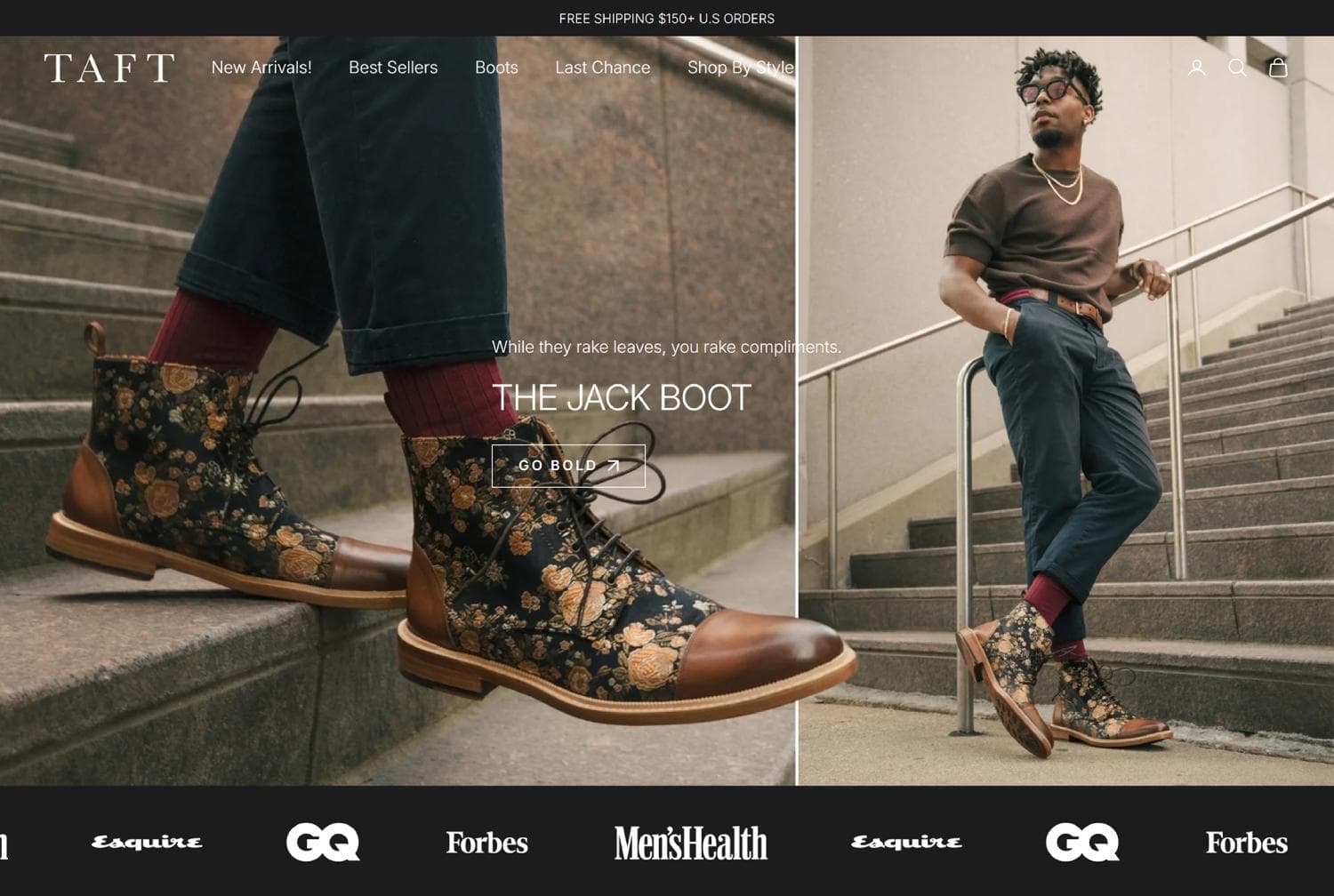
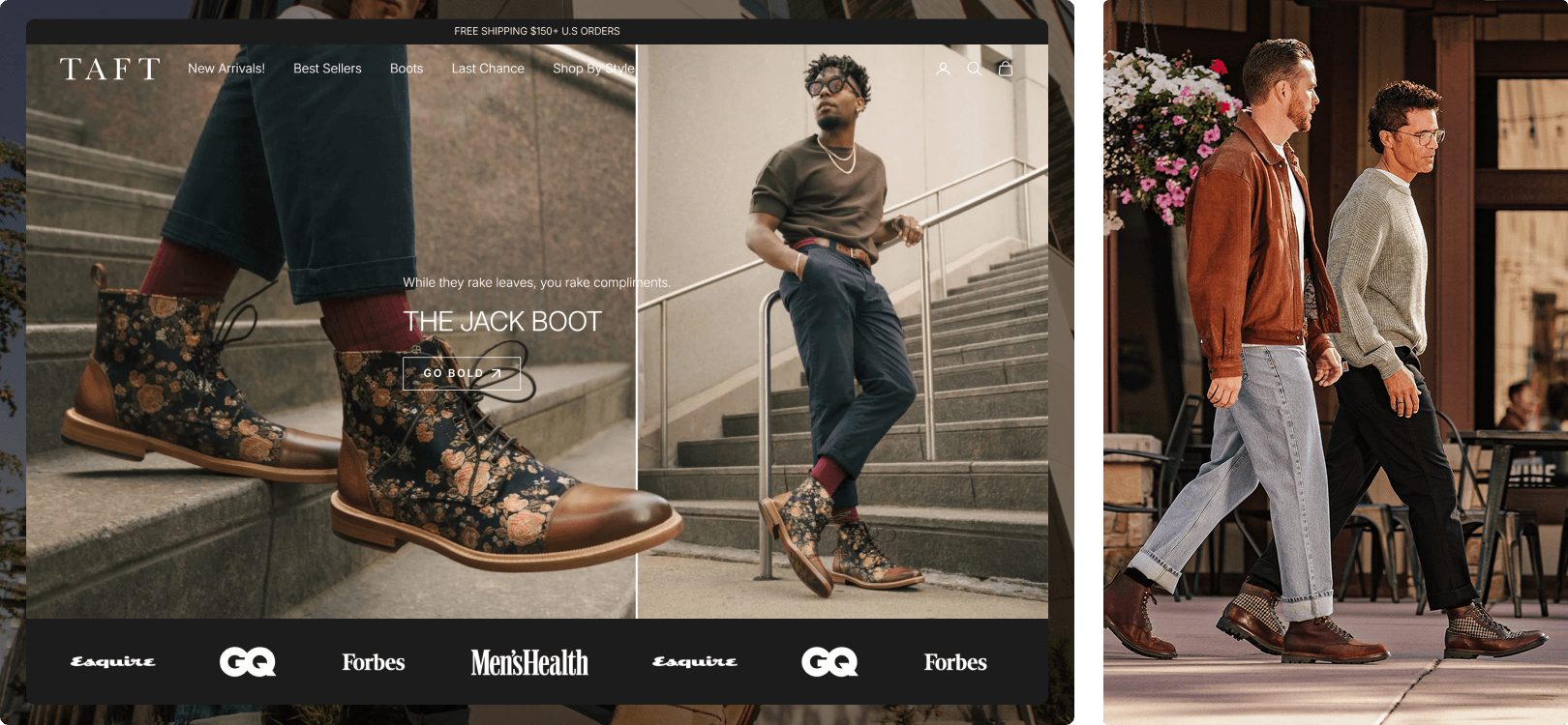
When TAFT Clothing approached us, they were ready to evolve their digital presence into something that truly reflected the strength of their brand. The goal was clear: an elevated, on-brand experience that felt effortless for customers while supporting the complexity of selling footwear online.
Optional text
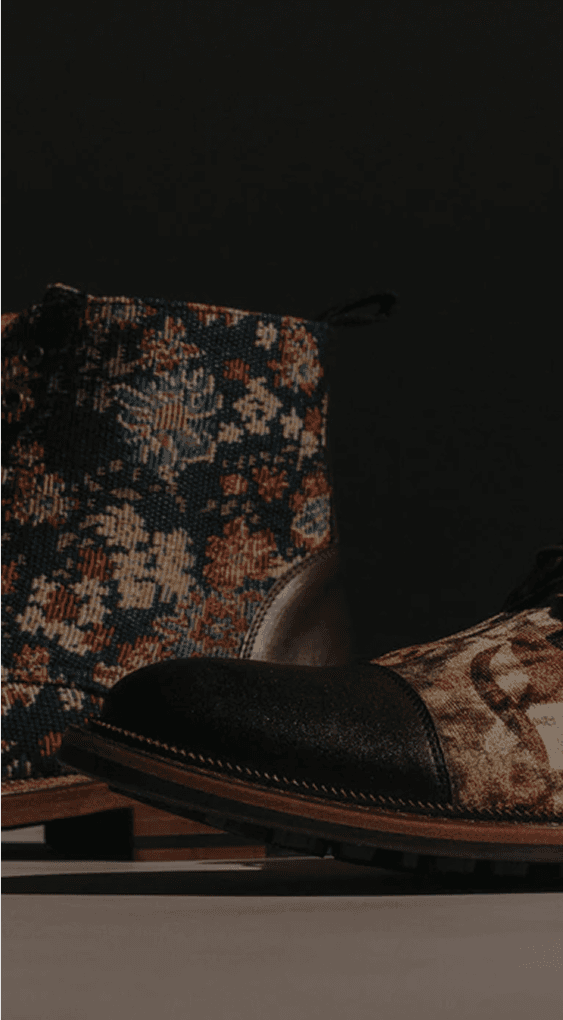
Drag the slider or click anywhere to compare
The Challenge
Transforming TAFT’s key touchpoints into seamless experiences
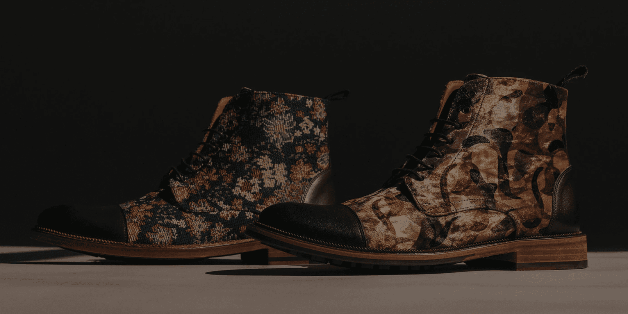
Footwear is one of the most challenging products to build a clean UX for, for the amount of information to display is sometimes bigger than for other kinds of products. Making it easier for customers to window shop and purchased their favorite TAFT boots effortlessly while aligning with brand image was our mission.
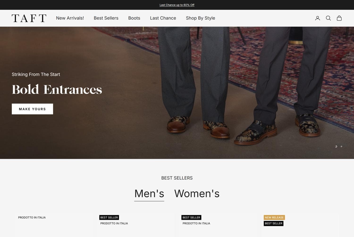
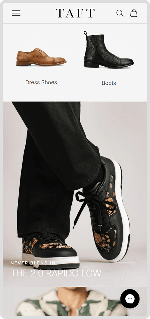
We focused on their most important touchpoints—Homepage, Collection Page, and Product Page—reimagining each to better guide shoppers from first impression to purchase. Product visualization was a central challenge: shoes demand detail, fit, and clarity. We enhanced filtering, introduced an elevated quick-shop functionality, and refined layouts so customers could browse, compare, and select with ease.
Our Approach
Craft, clarity, conversion
We rolled up our sleeves and worked side-by-side with the client’s tech team, blending our eCommerce expertise with their operational know-how to nail this project. Here’s how we pulled it off:
Shopify Admin Clean Up
We reorganized TAFT’s Shopify admin, simplifying product management and content updates. What was once tangled and time-consuming is now structured, scalable, and effortless to maintain—freeing the team to focus on growing the brand, not wrestling the backend.
Customer Focus
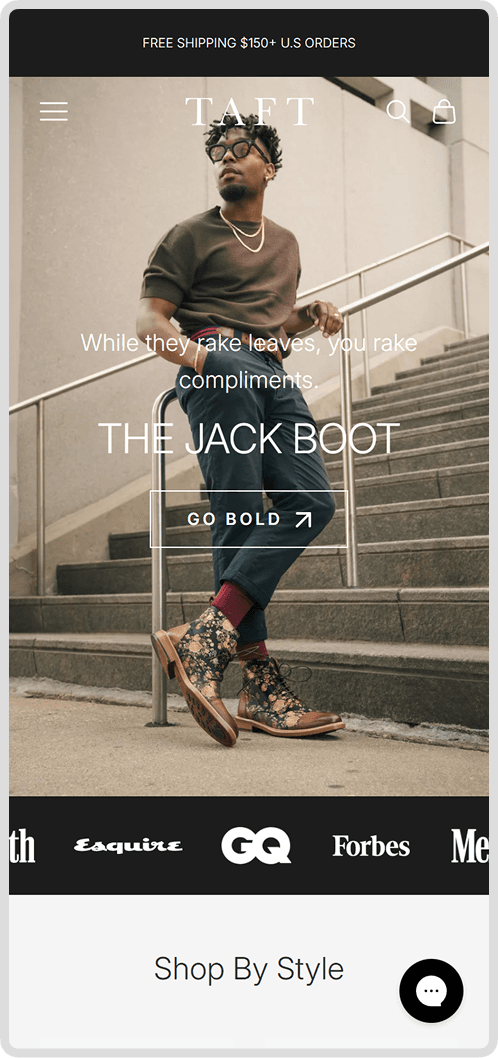
We redesigned TAFT’s UX to feel cleaner, sharper, and easier to navigate—removing clutter, refining hierarchy, and guiding users naturally from browse to buy. The result is a neater, more focused experience that mirrors the craftsmanship and confidence of the brand itself.
Gradual UX Improvements
We rolled out the new experience in stages, introducing design and UX improvements gradually to protect conversion rates and help customers adapt naturally. Each release moved TAFT’s image forward—modernizing the site without disrupting the familiarity that drives trust and sales.
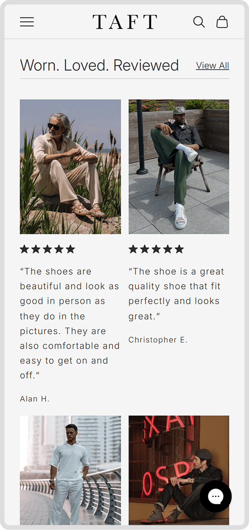
Social Proof + UGC
We brought TAFT’s community to the forefront, highlighting real customer photos and five-star reviews throughout the shopping journey. By integrating authentic voices into the design, we turned social proof into a powerful layer of trust and conversion.
The Result
A Digital Transformation
The result is a website that doesn’t just look polished, but feels seamless to navigate. TAFT’s customers now enjoy an intuitive, conversion-ready journey that mirrors the craftsmanship of the brand itself while allowing the brand team to enjoy a better experience overall on their own website.
Other projects


Kuru | Footwear


Jack & Jones


Only
